A XAML Guy digs into ASP.NET MVC4 (Part 2 of ?)
Introduction
Hey, you came back! Well thank you very much. I’m kind of surprised to see the amount of attention the first part received. From being featured on The Morning Brew to being featured in the ASP.NET community Spotlight, it seems that I have hit on a topic that a lot of people are interested in. Let’s not waste anymore time and jump back into the series.
The Series so far:
Part 1 - Dives into setting up your MVC4 Development Environment and exploring the templates provided by Microsoft. We briefly discuss some differences between MVC3 and 4 and then add a new page to our project. We end the first part with a basic understanding of ViewBags, Views, Controllers, Razor Syntax, ActionLink and ActionResult.
Back to MVC4
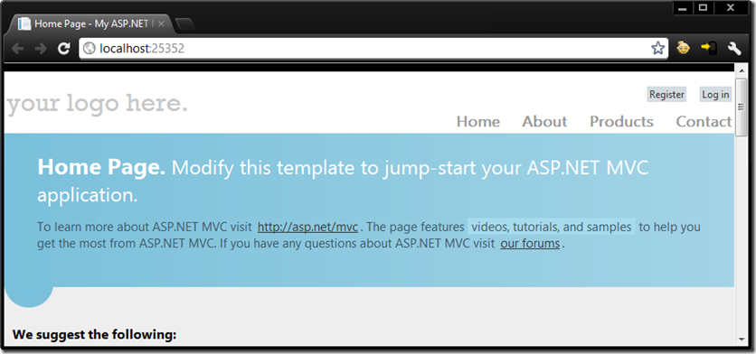
We wrapped up the first part of the series by creating a new page in our MVC4 project named Products. Our application looks identical to the default template with exception of the Products link.
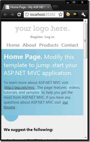
We haven’t added any additional code but if we change the size of the browser window then we will see this :
Did you notice that the content adapted to the window size? How did this happen? Well, it is partially possible because of line 10 found in the _Layout.cshtml which is a meta tag named viewport. This will match my layout width with my device width. As the layout changes, so does the content. In MVC3, we had to manually add this to our page and in MVC4 it is added automatically.
<meta name="viewport" content="width=device-width" />
The other piece to the puzzle (look at the Register and Log in buttons on the second image) is the CSS styling found in Content -> Site.css. You can scroll down the page to line 463 and you will see the following code snippet:
/********************
*   Mobile Styles   *
********************/
@media only screen and (max-width: 850px) {

/* header
----------------------------------------------------------*/
header .float-left,
header .float-right {
    float: none;
}
In this sample, we will see that we are using a CSS3 media queries to assign specific CSS depending on the device width.
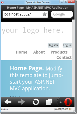
If we go ahead and comment out the CSS3 Media Query and the Meta Tag and look at this in a mobile browser (like Opera Mobile) then it will look like the following:
Very ugly! Our register and log in buttons still have the grey background and the Contact link is not lined up. The only reason that I decided to show this now is that is important to know how to get your web applications working with a variety of screen resolutions. We are in the age of mobile devices like phones and tablets. Adding ViewPort and understanding CSS3 Media Queries is one method to combat this, but sometimes we need to create specific views in our MVC4 application. (more on that later)
Exploring Mobile Browsers a bit further before moving on.
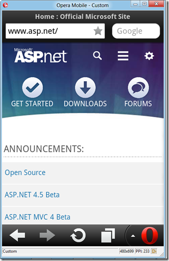
I’m a big fan of using the Windows Phone 7 emulator that ships with Windows Phone SDK, but unfortunately it is not supported in VS11 Beta. That is ok though as Opera has a pretty solid mobile browser available to download and it works just fine on Windows 8. You can download it by visiting: http://www.opera.com/developer/tools/mobile/.
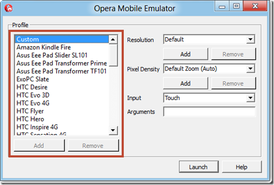
Once that is downloaded and installed then you can easy switch profiles to target the device you wish to optimize for. You can also change resolution, pixel density and the preferred input. In my case, I left it as custom and hit Launch, but I’m sure it would be fun to test with the Kindle Fire profile.
Once it is launched then you can see what your application looks like in a mobile browser with your specific settings.
Back to our App – Some Quick Fixes
Two things that I think we should fix before going further:
- The “your logo here”
- The Page Title
We can fix the “your logo here” by going into the _Layout.cshtml and changing line 16 to something similar to the following:
<p class="site-title">@Html.ActionLink("Sell Something", "Index", "Home")</p>
Next up, we need to fix the Page Title by default it looks something like this for our Products page: Products Page - My ASP.NET MVC Application.
We can fix that by going to line 5 in our _Layout.cshtml page and changing it to something like:
<title>@ViewBag.Title - Sell Something</title>In case you didn’t notice, we did both of these changes in the _Layout.cshtml where the changes would carry over to all of our pages. We want to make sure the ViewBag.Title remains in the title tag as that will give us the current page they are on. It is also worth noting here that the changes would not affect other views with a name of say ViewName.mobile.cshtml.
Creating Mobile Specific Views in our MVC4 application with the help of Recipes
Recipes? Is this something that I use to help me cook a dish? No, recipes in MVC4 are what Phil Haack describes as “scaffolding on steroids”. These are what I like to call mini-applications that allow you to accomplish tasks. They are delivered via NuGet and can be written in Windows Forms or WPF. Let’s go ahead and look at one of the most common and useful one.
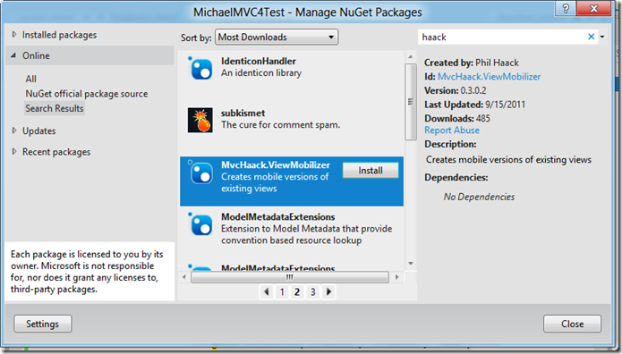
If you don’t have NuGet installed then go ahead and do that. NuGet is simply a package management system that is included out of the box if you are using VS11 Beta. So right click your project and select “Manage NuGet Packages” and you will see the figure listed below.
Make sure you click Online and do a search for haack and select MvcHaack.ViewMobilizer and then hit Install.
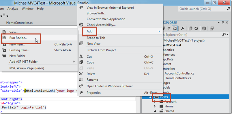
Now, you will need to right click on Views –> Add –> Run Recipe… from within your MVC4 application as shown below:
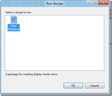
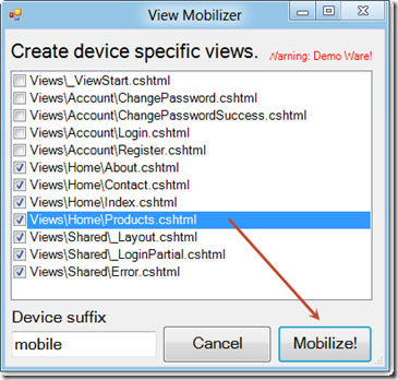
I’ve only installed the one that Phil Hack created, so click on View Mobilizer and select OK.
You can use this recipe to create device specific views. By default, it is going to create views of all of the views that you selected and add “mobile” to the filename. So, your mobile view filename for products would be: Products.mobile.cshtml. This will allow your users to see the mobile view if they enter your site with a mobile device (duh!) You can change the word mobile in the textbox to something more specific if you wanted to target certain mobile devices such as the iPhone. You may something like “iphone” and it will create views named SampleView.iphone.cshtml.
Go ahead and select some views and hit Mobilize.
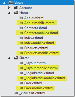
You can see in the Views folder now your new mobile pages have been created.
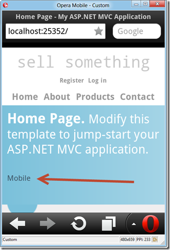
If you make a quick modification to say your Index.mobile.cshtml (I just added the word Mobile) and view it in your mobile browser than that view will be shown once a mobile browser is detected.
Inside of a desktop browser that view is not served up and the user would not see the text mobile because it served up Index.cshtml.
Wrap-up
We touched on a variety of topics in this section, from ViewPorts to CSS3 Media Queries, to exploring a mobile browser offered by Opera. We also added some quick fixes for page title and fixed our logo text. We wrapped up by looking at recipes in MVC4 to help us create mobile specific views. So if you are wondering where we are headed next, then I’m hoping to add more functionality to the Products page and continue documenting my ride in MVC4 – but anything goes at this point. I’m planning on digging into JavaScript as well as look at other ways to enhance our application.
Be sure to check out Telerik's MVC extensions if you have not done so already. They support MVC4 Beta and are available in both a commercial and an open source version. The commercial version with dedicated support is available here, and the open source version is available here. If you are a XAML person (like myself) then check out their Silverlight and WPF offering.
Also, the “latest and greatest” bits of all Microsoft Products can be found below.
Windows 8 Consumer Preview Download | VS11 Beta Download | Azure SDK | Azure Trial | Windows Phone SDK | WebMatrix
TweetFollow mbcrumpNo new comments are allowed on this post.

Comments
No comments yet. Be the first!